UI and UX Design:
Decide How It Works Before How It Looks
Journeys, architecture, wireframes and prototypes. The cheapest time to change a layout is before it exists.
Then the interface on top of it. Designed in Ho Chi Minh City for brands across the US, UK, Australia and Europe.
UX comes first because a beautiful interface over the wrong structure is still the wrong structure. Our service covers journey mapping, information architecture, wireframes and interactive prototypes, then the interface design that sits on top, handed over as components that feed straight into the design system and the build.
Most conversion problems are structure problems
When a page underperforms, the instinct is to change the colour of the button. It is almost never the button. It is that the page asks for commitment before it has earned it, or buries the one thing the visitor came for beneath the things the business wanted to say.
UX design is the work of settling that before anything is designed or built: who is arriving, what they are trying to do, what they need in order to act, and what order that has to happen in.
We work in wireframes and prototypes precisely because they are cheap to throw away. Moving a section in a prototype costs an hour; moving it after launch costs a sprint and an argument. The output feeds straight into the design system and the build.
THEN THE INTERFACE
Where UI comes in
Once the structure is settled, the interface gets designed properly: type scale, colour, spacing, iconography, interaction states, and the small motion decisions that make something feel considered rather than assembled.
We design it as components rather than as pages, because a page is a one-off and a component is reusable. That is what makes the fiftieth page look like the first, and it is the handover point into the design system.
One thing we will not do is design a beautiful interface over a structure we think is wrong. If the wireframe stage surfaces a problem with the proposition or the journey, we would rather have that argument in grey boxes than in full colour three weeks later.
METHOD
How we actually do it
Cheap to change, in that order.
Understand the decision, not the persona.
We care less about demographics than about the decision being made: what triggers it, who else is involved, what would stop it. B2B purchases with four stakeholders need a different structure from an impulse buy.
Map the journey and the architecture.
Entry points, paths and exits, then the information architecture that supports them. Navigation is a UX decision with an SEO consequence, we design it with technical SEO in the room.
Wireframe the pages that carry the revenue.
Not every page. The ones that convert, in grey boxes, so the conversation stays about hierarchy and sequence rather than typefaces.
Prototype and test the critical journeys.
An interactive prototype for the flows that matter, put in front of real users where budget allows. Watching five people fail the same step is worth more than a month of internal debate.
Design the interface, then hand it over as components.
Type, colour, spacing and states applied to the agreed structure, built as reusable components rather than as flat page comps, so the build team is assembling rather than interpreting.
What you get
Deliverables, not adjectives.
ACCESSIBILITY
Accessibility starts here, not in development
Most accessibility failures are decided at design stage and discovered at launch. Contrast that fails on a pale grey caption, a focus state nobody drew, tap targets too small on a phone, a heading order chosen for looks rather than meaning: all of those are design decisions, and all of them are far cheaper to get right in a wireframe than in a codebase.
So we check them as we design rather than auditing afterwards. It costs almost nothing at this stage and it removes the most common reason a build fails an accessibility review later.
Who this works for
Traffic is fine and conversion is not.
The classic symptom, and almost always structural rather than cosmetic.
You are about to commission a build.
The cheapest possible moment to do this work, and the most expensive one to skip.
Your site grew rather than being designed.
Navigation that made sense at twelve pages and stopped making sense at ninety.
Several audiences need the same site to do different things.
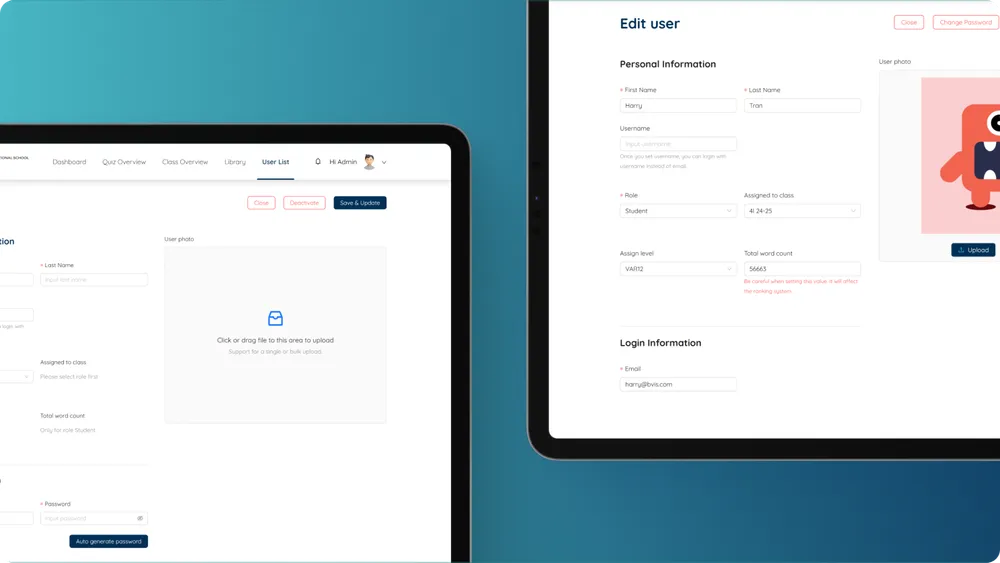
Students, teachers and administrators, or buyers and suppliers. BVIS is the example.
Most often for education, e-commerce with large or configurable catalogues, B2B and professional services, and SaaS, for clients headquartered in the US, UK, Australia, Canada and the EU as well as businesses operating inside Vietnam.
Questions, answered straight
No fluff, as promised.
Can we skip UX and go straight to design?
You can, and it usually costs more. Structural problems found during build are expensive to fix and tend to get shipped instead. Wireframes are the cheapest insurance in the process.
Do you do user testing?
Where budget allows, yes, even five sessions surfaces the obvious failures. Where it does not, we lean on analytics, session recordings and search data, which tell you a surprising amount about intent.
How does UX affect SEO?
Directly. Information architecture determines internal linking and crawl paths, and page structure determines whether content is legible to a machine. We design them together rather than retrofitting.
What is the difference between UI and UX design?
UX decides how something works: the journey, the structure, the order things happen in. UI decides how it looks and feels: type, colour, spacing, states. UX comes first, because a beautiful interface over the wrong structure is still the wrong structure. Most projects need both and we do both.
How long does it take?
Typically a matter of weeks for the UX phase on a standard website project, longer where there are several distinct audiences or a complex catalogue. The variable that moves it most is how quickly decisions come back from your side.
Do we get the design files, and do we own them?
Yes and yes, from the start rather than at handover. If you later take the work to a different build team, the wireframes, prototypes and component designs all go with you.
Can you do UX without redesigning the whole site?
Often, and it is frequently the better spend. Restructuring a checkout, a navigation or a handful of revenue pages can move more than a full redesign, at a fraction of the cost. We will tell you honestly which one your situation calls for.
Do you design for accessibility?
Yes, at design stage rather than as an audit afterwards. Contrast, focus states, target sizes and heading order are all design decisions, and getting them right in a wireframe costs almost nothing compared with fixing them in a finished build.
Will you tell us if the problem is not the design?
Yes. Sometimes a page converts badly because the offer is wrong, the price is wrong or the traffic is wrong, and no amount of restructuring fixes that. We would rather say so at the start than redesign something that was never the problem.

Something not converting?
Tell us what you're working on. You'll get an honest answer about whether we can help, and exactly how.