The Emotional Palette of Branding
- Creating an Emotional Connect
- Dressing for the Occasion
- Unique Identity
- Consistency is Your Style Signature
- Speaking Without Words
- Cultural Context and Trends
- Target Audience Alignment
- Flexibility and Evolution
Let’s take Saigon Digital Branding as an example


Creating an Emotional Connect
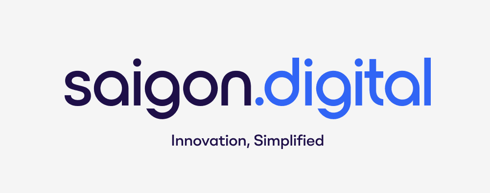
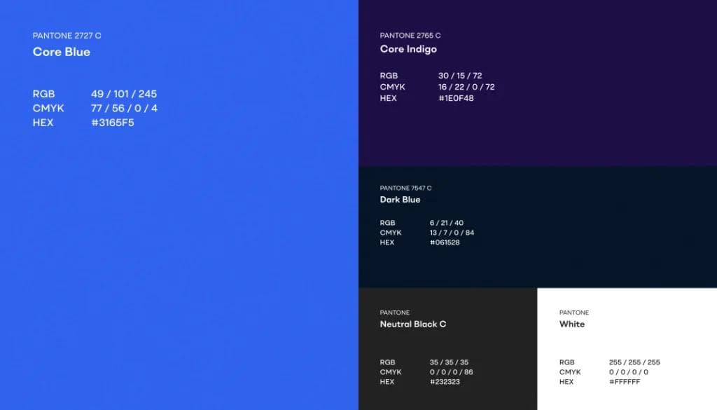
The Power of Blue in the Saigon Digital Logo - Just like a warm hug or a reassuring smile, colours in branding create an emotional connect with the audience. The Saigon Digital Logo harnesses the tranquil yet powerful essence of blue - a colour that resonates deeply with feelings of trust, reliability, and professionalism. This colour doesn't just define the visual appeal; it connects with the audience on an intuitive level, invoking a sense of security and confidence in the digital solutions provided.Dressing for the Occasion
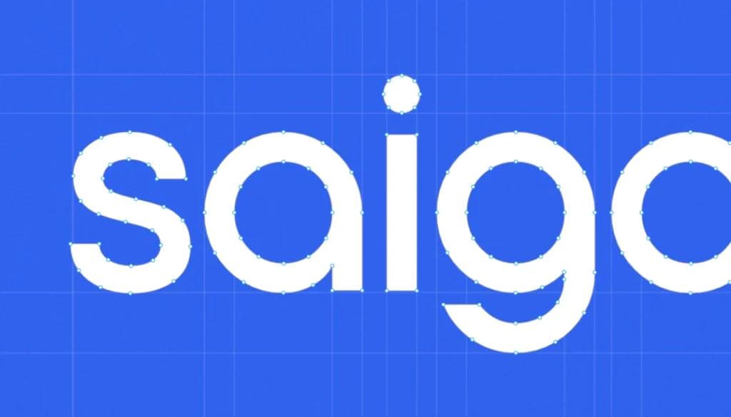
Typography Tells a Story - The clean, modern sans-serif typography used in the logo mirrors the clarity and efficiency that Saigon Digital aims to bring to its clients. It speaks of a no-nonsense approach to digital solutions, where ease of communication and straightforwardness are as integral as the code that builds the digital landscape.So what’s helping our brand Standing Out in the Crowd?
Unique Identity
The dot ‘.’ in the logo - In a market bustling with options, a unique colour scheme makes a brand pop out, just like a distinctive dress in a sea of uniforms.In the world of online branding, the ‘.digital’ serves as more than a domain - it’s a statement. It signifies Saigon Digital's realm of expertise and the forward-thinking mindset that drives its mission. This small but mighty detail encapsulates the essence of a brand that is all about connecting dots, be they conceptual or digital.Consistency is Your Style Signature
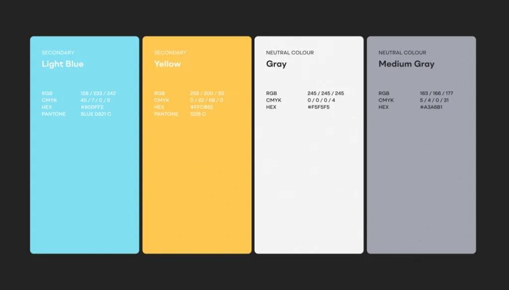
Just as people are recognized by their signature style, consistent use of a colour scheme becomes a brand's signature. Every touchpoint with the customer - be it a product, advertisement, or social media post - wears this signature, building a cohesive and reliable brand image.
And for the last: The Psychology Behind Colour Choices
Speaking Without Words
Colours have their own language, speaking to the subconscious mind. They can convey luxury, affordability, excitement, or tranquility. Understanding colour psychology allows brands to communicate effectively with their audience, much like choosing the right words in a conversation.Cultural Context and Trends
Just as fashion varies across cultures and trends, so do colour perceptions. A successful brand understands the cultural context of its audience and adapts its colour scheme accordingly, ensuring that its message resonates well across different backgrounds.
Dressing for the Audience
Just as you might choose a dress considering who you're going to meet, brands choose colour schemes based on their target audience.
The Symbolism of 'sd'
The interlocking 'sd' initials form a unique symbol of unity and partnership. This emblem serves as a reminder that Saigon Digital is about bringing together different elements—people, technology, and ideas—to create something greater than the sum of its parts.Flexibility and Evolution
Over time, just like personal tastes evolve, so might a brand's colour scheme. A brand might refresh its colours to stay relevant and appealing to its audience, much like updating a wardrobe with changing times and trends.The Saigon Digital logo is not just a visual marker but a narrative of its ethos. It’s a symbol of trust, an icon of innovation, and a bridge between traditional values and the digital future. It encapsulates a promise to its clientele and a representation of its place at the forefront of Saigon Digital's frontier.This logo tells a story with colour and design, inviting audiences to connect with a brand that is as dynamic and spirited as Saigon itself. It's a perfect example of how logos do much more than identify - they communicate, reassure, and inspire.Communication through Colour
In the grand ball of the market, a brand's colour scheme is its dance, making every move count in telling its story and connecting with the audience. Just as personal style is about expression, connection, and making the right impression, so is a brand's colour palette.
It's a blend of art, psychology, and strategy, all coming together to create a brand's most human aspect - its ability to feel and be felt. So next time you encounter a brand, take a moment to appreciate the thought behind the colours you see, for they are speaking to you, hoping to make a human connection.Looking to enhance your brand's UX/UI design? Saigon Digital offers expert services to elevate your user experience and interface.There is one thing to keep in mind, creating a captivating brand identity is just the first step. In today's digital world, ensuring your target audience can find you online is crucial. Explore Saigon Digital's SEO services and and see how we can help your brand stand out in search engine results. Contact us today, and let's craft a digital experience that sets your brand apart.


