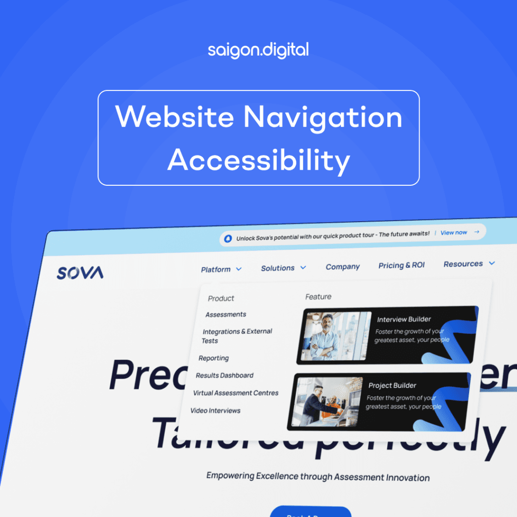
Importance of Web Navigation Accessibility
Think of web navigation like a friendly map that helps everyone get around a website. It's super important because if it's not easy to use, people might have a tough time finding what they need or doing stuff on the site. By making our website navigation accessible to everyone, we're making sure all our online buddies can find their way around without any hassles.
Clear and Consistent Navigation Structure
To make a website easy for everyone to use, especially for those using special tools like screen readers, it's important to organise the website well. Here's how you can do it:- Headings: Use different levels of headings (like titles and subtitles) to show the order of information. Start with the main heading and then use smaller ones for details.
- Lists: Use list formats for groups of items. This helps people understand that these items belong together.
- Navigation: Mark menus and use the right HTML tags so screen readers can tell users it's a menu. For drop-down menus, use lists within lists.
- Buttons and Links: Use 'button' tags for things you click that do something on the page, and 'link' tags for links to other pages. Make sure their names describe what they do.
- Forms: When making forms, label each part clearly so users know what to fill in.
- Landmarks: Use HTML5 landmarks like 'header', 'main', 'footer', etc., to help users find different parts of the page easily.
- Tables: For tables, use the right tags to show which headings match which data. This helps screen readers explain the table properly to users.
Keyboard Accessibility
Keyboard access is super important for people who use keyboards or special tech to get around websites. Make sure everything that you can click on or use, like menus and links, works well with just a keyboard. Good focus on where you are on the page, clear signs showing where you're at, and a sensible order when you tab through stuff can really make a difference. This makes it a breeze for everyone to zip around your site.
Responsive Design and Mobile Considerations
As more people surf the web on their phones, it's really important to make sure websites work well on small screens and touch devices. Use cool design tricks so that the menus and stuff adjust nicely to any screen size. Also, don't forget to make those touch buttons big enough so everyone, including those with motor difficulties, can tap them easily without any trouble.
ARIA Roles and Landmarks
ARIA (Accessible Rich Internet Applications) roles and landmarks are like special tags that help people using assistive tools (like screen readers) understand what's on a webpage. For example, you can use ARIA to make it clear what each part of your website's menu does and how it fits into the page. This helps users find their way around easily.
Here's a quick example of how it works in website code:
- We use
<nav>to wrap the main menu and tell assistive tools that it's a navigation section. - We add
aria-label="Main Menu"to tell users this is the main menu. - Inside, we list menu items using
<ul>and<li>. - Each item is a link (
<a>) and tagged as amenuitemto show it's part of the menu. - We use placeholders (like
#) for the links, but on a real website, you'd replace these with actual page links. - We added some style so that when someone clicks or lands on a menu item, it gets a blue outline or turns yellow with black text. This makes it clear which item they're on.
Testing and Continuous Improvement
Regularly test the accessibility of your website's navigation using assistive technologies and engage users with disabilities for feedback. Conducting accessibility audits and user testing will help identify and address any barriers to web navigation. Embrace an iterative approach, making continuous improvements to enhance the accessibility and usability of your website's navigation.
Conclusion
Website navigation accessibility is a fundamental aspect of creating inclusive digital experiences. By focusing on clear structure, descriptive link text, keyboard accessibility, responsive design, ARIA roles, skip navigation links and continuous testing, we can ensure that all users, regardless of their abilities, can navigate websites effortlessly. Let's commit to making web navigation an inclusive and empowering experience for everyone.
You can visit our recent projects which implemented the concepts above for your reference- Case Study: Sova Assessment: Changing assessment for good


