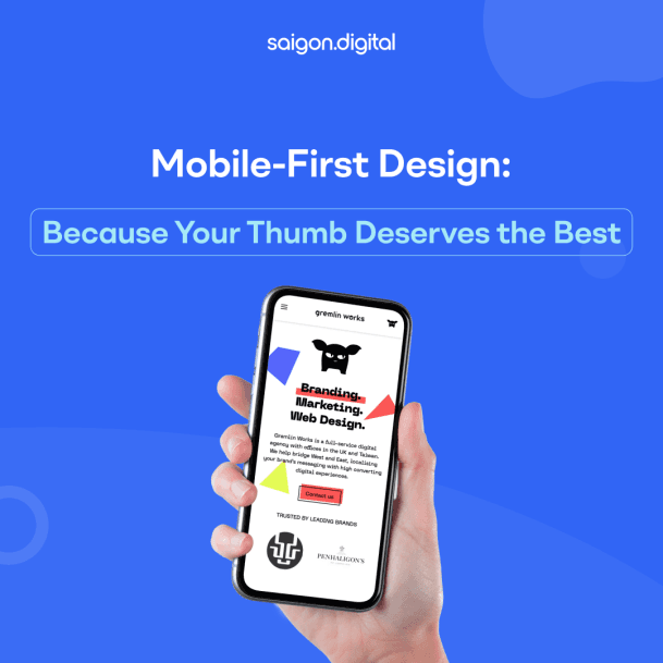
Why Mobile-First?
In the unfolding narrative of the digital age, smartphones are no longer just an accessory - they are the main character. Google has recognized this shift, prioritizing mobile-first indexing for ranking and indexing websites. Therefore, mobile-first design isn't just an option - it's a necessity.
Crafting a Thumb-Friendly Tale
Creating a thumb-friendly design means considering comfort, precision, and ease of use. Here's how we make sure that your mobile site is a joy to navigate:
The Thumb Zone
When people use their smartphones, the majority of navigation happens within the natural reach of their thumbs. We design with this in mind, placing essential navigation menus, buttons, and call-to-actions in the most comfortable areas of the screen. This ensures that your users don’t need to stretch, strain, or adjust their grip just to interact with your site.
Size of Elements
Tiny buttons and links can be frustrating on a small screen. We create touch targets that are large enough to be tapped easily with a thumb, reducing errors and eliminating the need for unnecessary precision. At the same time, we balance element size so they don’t overwhelm the layout, keeping the overall interface clean and visually appealing.
Spacing & Clarity
Crowded interfaces often lead to accidental taps and user frustration. To solve this, we maintain generous spacing between interactive elements, ensuring users can navigate with confidence. This spacing not only improves usability but also contributes to a more organized and professional-looking design.
Visual Hierarchy
On a mobile screen, clarity is everything. We use clear typography, intuitive icons, and well-structured layouts to guide the eye naturally from one element to the next. By establishing a strong visual hierarchy, we help users quickly find what they’re looking for, making the experience seamless and frustration-free.
Performance Focus
Speed is the backbone of a great mobile experience. We optimize your website for fast loading times, lightweight elements, and smooth interactions. This ensures that users stay engaged, search engines reward your site with higher rankings, and your business benefits from improved conversion rates.
Saigon Digital: Your Partner in Crafting Thumb-Friendly Narratives
At Saigon Digital, our mission is to create mobile-first designs that are thumb-friendly, user-friendly, and SEO-friendly. We don't merely shrink a desktop site to fit a mobile screen. Instead, we craft a mobile experience that is fun, engaging, and drives conversions.Our creative team focuses on fast loading times, responsive design, and SEO-friendly elements. We conduct extensive testing across different devices to ensure your users enjoy a seamless experience every time.Choosing Saigon Digital means choosing to put your users' thumbs first. We're here to build a mobile-first design that delights your thumb and boosts your business.
Our Range of Services
Beyond mobile-first design, Saigon Digital offers a range of services to cater to your digital needs:- Jamstack Development: Create a blazing fast, SEO friendly and highly optimized website with the future of web technology.
- Hubspot CMS Development: Harness the power of Hubspot to develop a website that generates opportunities and revenue.
- Headless e-Commerce: Get ahead of your competition with the latest technology - Headless e-Commerce on the Jamstack.
- Bespoke WordPress Development: Experience the power of a tailored, rich, and flexible content editing experience with WordPress.
- Support Services: Whether it's a new feature, technical advice, or improvement for UI/UX, we've got your existing website/application covered.
- Digital Transformation: Stay ahead of your competitors and future-proof your business with our digital transformation services.


