

What Is CRO Testing?
At its core, CRO testing (or Conversion Rate Optimisation testing) is the practice of experimenting with different versions of a web page, design element, or piece of content to see which one drives more conversions. A “conversion” might mean something slightly different depending on your business: completing a purchase, filling in a form, signing up to a newsletter, or booking a demo. The idea is simple but powerful. Instead of guessing what your users prefer, you run structured tests (often A/B or multivariate tests) to measure user behaviour. For example, you might show half your audience a red “Sign Up” button and the other half a green one. If the green button consistently leads to more sign-ups, you’ve found a winner. The key advantage of CRO testing is that it removes assumptions. It helps you understand how your actual audience behaves, and it gives you data-driven evidence to make decisions about design, messaging, and user experience.How CRO Testing Complements SEO
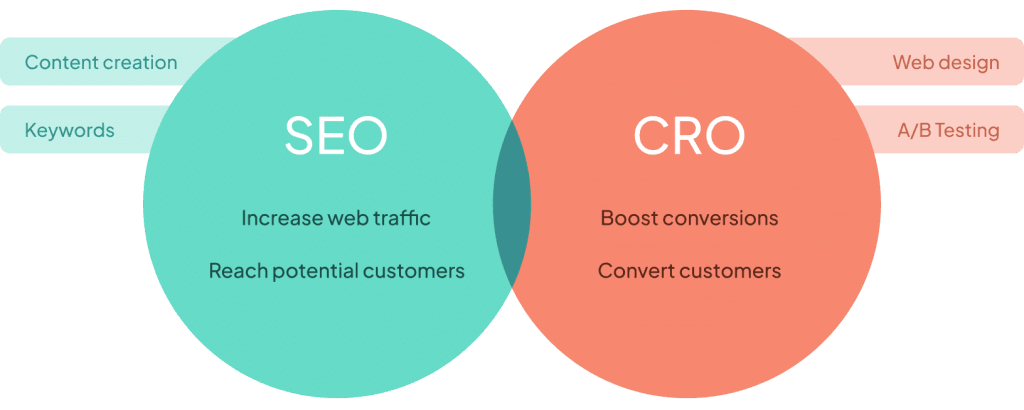
If you’re already investing in SEO (Search Engine Optimisation) , you’re halfway there. SEO focuses on bringing qualified visitors to your website. But attracting traffic is only the beginning. What happens after someone lands on your page is just as important. That’s where CRO testing steps in. Think of it this way:- SEO brings the visitors in.
- CRO converts those visitors into customers.
CRO Testing vs A/B Testing: Clearing the Confusion
The terms CRO testing and A/B testing are often used interchangeably, but there are subtle differences worth highlighting. CRO testing is the broader practice of running experiments with the goal of improving conversions. It can include A/B testing, multivariate testing, usability testing , heatmap analysis, and more. CRO testing is essentially the strategy: “How do we increase the percentage of visitors who take action?” A/B testing is a method within CRO. It refers specifically to splitting traffic between two versions (Version A vs Version B) of a page or element and measuring which performs better. For example, you may A/B test two headlines on a landing page. That’s just one tactic inside the bigger CRO toolkit.How It Differs from SEO A/B Testing
It’s also useful to clarify how CRO A/B testing differs from SEO A/B testing, as the two aim at different outcomes: CRO A/B testing focuses on what happens after a visitor arrives on your site. The goal is to maximise conversions by testing on-page elements like CTAs, forms, layouts, or messaging. SEO A/B testing , on the other hand, is about improving organic search performance. Here, you might test different meta titles, descriptions, or content structures across sets of pages to see which version ranks better or drives higher click-through rates from search results. To put it simply:- SEO A/B testing = bringing in more of the right traffic
- CRO A/B testing = converting that traffic once it’s on your site
7 CRO Testing Ideas to Run This Month
Once you have a clear understanding of what CRO testing is and how it supports your wider digital strategy , the next step is to put it into practice. Below, we’ve outlined seven practical CRO testing ideas you can run this month to uncover quick wins, gain valuable insights about your audience, and start improving conversions right away.1. Headline / Hero Rewrite and Messaging Variants
What to test
Your headline (and sub-headline) is often the first thing a visitor sees. It sets expectations. A weak or vague headline can confuse or lose people immediately. Ideas to try:- Test a benefit-focused headline vs a feature-focused headline
- Try a question (“Are you struggling with X?”) vs a statement (“Achieve X in 3 steps”)
- Swap in a specific number (e.g. “Increase leads by 30%”)
- Shorten or lengthen the headline, sometimes more specificity or brevity helps
Example
Suppose your current hero says: “Software that simplifies your marketing workflow.” You could test:- “Get 30% more qualified leads in 30 days”
- “Struggling to manage marketing tasks? Try our system.”
- “All-in-one marketing instrument for teams”
2. Call-to-Action (CTA) Text, Colour and Placement
What to test
The CTA button is arguably the most critical conversion lever. Changing the wording, colour or even placement can yield noticeable uplifts. Test variations such as:- “Get Started Free” vs “Request Demo” vs “See It in Action”
- A more urgent or specific label (“Start Your 14-day Free Trial”)
- Colour contrast (try a button that pops vs a more muted tone)
- Positioning: above the fold, sticky, in multiple places
Example
If your current CTA is a blue “Submit”, try a contrasting orange or green “Get My Free Quote”. Or test moving the CTA from the centre to a sticky bar at the bottom of the screen. Even small changes like “Download Now” → “Send Me My Download” can improve click rates.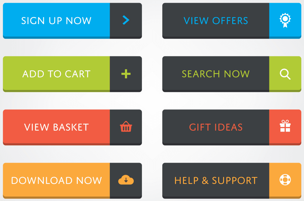
3. Form Simplification and Field Testing
What to test
Forms often cause drop-off. The more fields you ask, the more friction you introduce. Variants to try:- Test a short form (name + email) vs a longer form (add phone, company, etc.)
- Move non-essential fields to a second step (multi-step form)
- Use smart defaults, placeholders, inline validation
- Change the submit button label (e.g. “Get My Free Sample” vs “Request Now”)
Example
Say your lead form currently has 7 fields. Test a 3-field variant (Name, Email, Company). Compare completion rate. If the shorter version converts better, consider capturing additional information later (e.g. via email follow-ups). You might also test a multi-step form: step 1 (email), step 2 (optional extra info). Many visitors psychologically prefer incremental progress.4. Social Proof / Trust Elements
What to test
Adding or repositioning social proof (testimonials, logos, ratings, reviews) can increase trust and reduce scepticism. Possible variants:- Show customer logos / trust badges near the top vs bottom
- Add a testimonial next to the primary CTA
- Display user count / numbers (“Join 5,000+ customers”)
- Showcase star ratings / reviews
Example
If your product page currently lacks social proof, run a version that adds a carousel of customer quotes under the hero section. Alternatively, test placing trust badges (e.g. “SSL Secure”, “As seen on …”) next to the CTA. Measure how each placement or format impacts clickthrough to the next funnel stage.5. Pricing Page / Plan Presentation Tweaks
What to test
When visitors reach pricing or plan pages, clarity is key. Confusing tables or poorly highlighted recommendations can lower conversions. Variants to consider:- Change the default “most popular” plan
- Highlight one plan visually (colour, badge)
- Simplify plan tables (fewer columns/features)
- Use “decoy pricing” (a deliberately inferior option to push users to the middle plan)
Example
Suppose you have three plans: Basic, Pro, Premium. Try a version where “Pro” is emphasised (e.g. larger card, badge “Best value”). In another variant, remove the Premium option to nudge people toward Pro. You can also test rewording feature descriptions or dividing the features into “must-haves / optional extras”.6. Exit-Intent / Pop-Up Offers
What to test
An exit-intent pop-up (i.e. when users move to leave) gives you a last opportunity to convert. But poorly timed or intrusive pop-ups hurt experience. Variants to try:- Offer a discount, free download, or chat offer on exit
- Delay the pop-up until the visitor scrolls or lingers
- Test size / layout / wording
- vs no pop-up (baseline)
Example
On a product or pricing page, deploy an exit-intent pop-up offering “10% off if you stay and order now”. A variation might be “Download our free guide while you decide”. Compare bounce vs conversion rates. Caution: ensure mobile behaviour is handled gently (mobile exit pop-ups can degrade UX).7. Content Order and Layout / Visual Hierarchy Changes
What to test
Sometimes the sequence, spacing or visual emphasis of content blocks influences persuasion. Ideas to experiment with:- Swap the order of sections (e.g. move features above benefits)
- Introduce or emphasise bullet point summaries
- Change image / video placements
- Adjust white space, fonts, alignment to increase scanability
Example
On a landing page, you may currently list features first, then benefits. Try a variation that starts with strong benefits, then supports with features. Or test a version where you insert a video early vs later. You could also try breaking long paragraphs into more digestible bullets, or introducing icons beside benefits.How to Structure and Prioritise Your CRO Tests
Running seven tests in one month is ambitious. Here’s a compact approach to manage this:1. Start With Data and User Insight
Use analytics (e.g. Google Analytics), heat maps, session recordings and user feedback to identify which pages or steps have high drop-off. That will help prioritise which test to run first.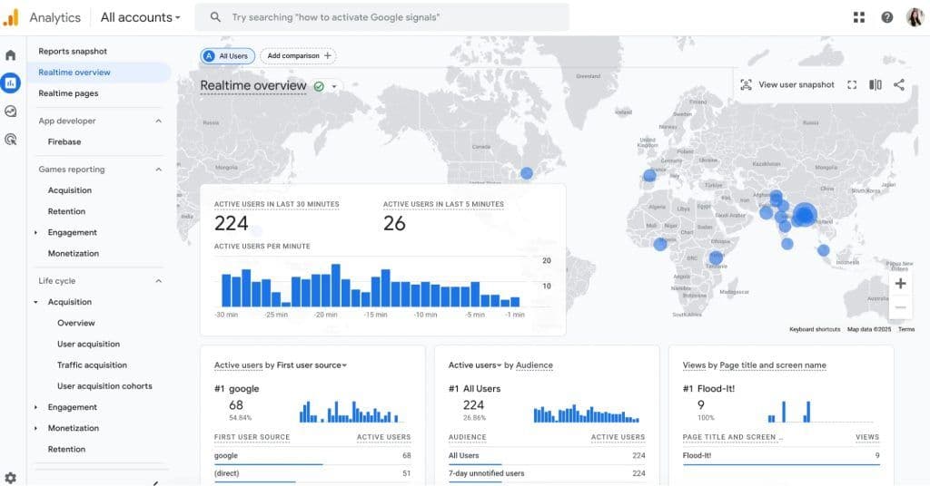
2. Use a Hypothesis and Metric
For each test, document a hypothesis: “Changing X to Y will increase conversion by Z%” . Also assign a primary metric (e.g. form submissions, clickthrough to pricing).3. Apply a Prioritisation Framework
Frameworks like PIE (Potential, Importance, Ease) or ICE (Impact, Confidence, Effort) can help you pick which test to run next.4. Run Tests Sequentially When Possible
Especially if they might interact, don’t run all seven at once. Start with those most likely to move the needle (headline, CTA).5. Ensure Test Duration and Significance
Let tests run long enough to collect sufficient data. You should avoid stopping early just because one variant looks better. Statistical validity is key.6. Analyse and Iterate
Even if a test “loses”, you still would have learnt something or gained unexpected knowledge from it. From these compounded insights, use them to inform the next generation of tests.Tips to keep your testing programme clean
- Always backup original pages, and ensure variation pages are properly QA’d
- Use consistent measurement (so results are comparable over time)
- Document each test (date, hypothesis, result, learnings)
- Avoid running tests during large promotions or traffic anomalies
- Watch for interaction effects (a variation in one place may affect behaviour elsewhere)