The Art of Typography in Branding: Speaking Your Brand's Language
Just as our choice of words can express our personality and values, typography in branding serves as the voice of a company, setting the tone and reflecting its character. From the elegance of a serif to the straightforwardness of a sans-serif, every font tells a story. Let's explore how to choose the right typography that not only aligns with your brand's message but also amplifies it.

Understanding Typography and Brand Personality
Typography is the art of creating and arranging type to make the written language legible, readable, and visually appealing. It's a powerful tool in branding, capable of conveying a brand's tone and personality at a glance.- Serif Fonts: Traditionally associated with respectability and reliability. Ideal for brands that want to exude professionalism, tradition, and academic credibility.
- Sans-Serif Fonts: Known for their clean lines and modern look. They're great for brands looking to project an approachable, clean, and minimalist image.
- Script Fonts: Reflect elegance, creativity, and intimacy. These are perfect for brands that want to convey a sense of sophistication or a personal touch.
- Display Fonts: Bold and often unique, these fonts are used to grab attention. They suit brands that are youthful, energetic, or want to make a strong impression.


Define Your Brand's Core Values
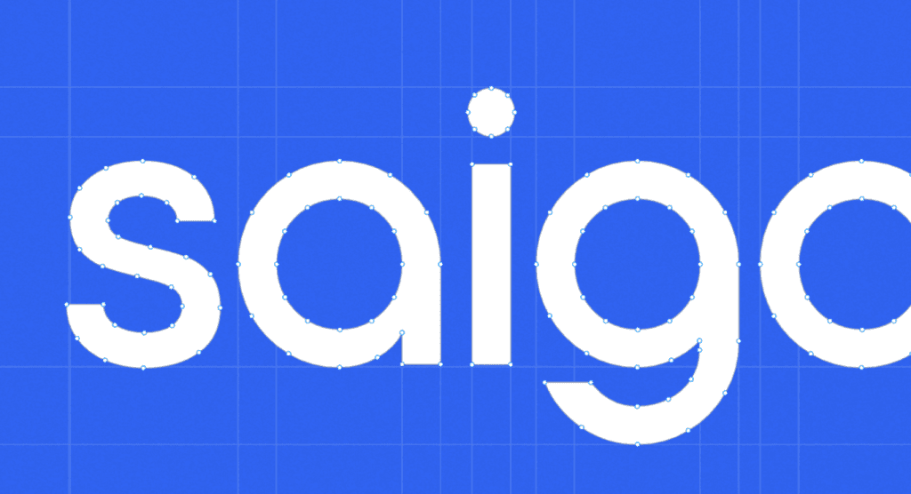
The Saigon Digitallogo employs a sleek, modern sans-serif typeface. The simplicity of the sans-serif font resonates with the digital world's clarity and efficiency - it is uncluttered, readable, and forward-looking.Here’s what it conveys:- Modern and Clean: The sans-serif typeface reflects a modern, clean aesthetic. In the digital realm, where user experience is king, this clarity is crucial. It suggests that Saigon Digital provides straightforward, no-nonsense digital solutions.
- Versatility: The chosen typography is highly scalable, maintaining legibility across various platforms, which is essential for digital branding. Whether viewed on a smartphone or a desktop, the logo remains crisp and discernible, a nod to the brand's adaptability in a multi-device world.
- Consistency Across Branding: The consistent use of this typography across Saigon Digital's branding materials fosters a strong, unified brand image. It's a commitment to consistency that helps build recognition and trust with the audience.

Audience Consideration
The typeface used in the Saigon Digital logo is straightforward and unembellished, indicating a universal appeal. It speaks to a broad audience, not limited by age or niche interests. This inclusivity reflects the brand's desire to serve a diverse clientele, from tech-savvy millennials to more mature business professionals seeking digital solutions.Competitive Edge
By choosing a clean and minimalist sans-serif font, Saigon Digital differentiates itself from competitors that might use more ornate or traditional typefaces. This typographic choice positions the brand as a contemporary and dynamic player in the digital services market, appealing to those looking for fresh, efficient solutions.Legibility and Readability
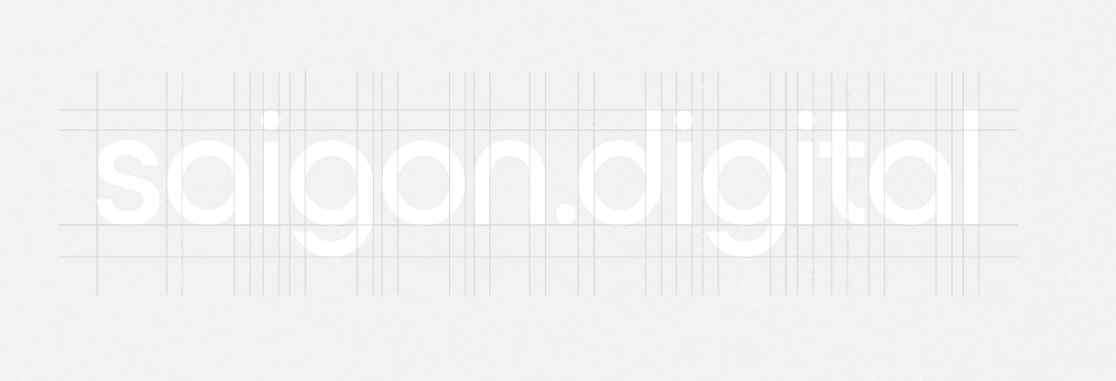
The typeface in the Saigon Digital logo maintains high legibility, with generous spacing and clear letterforms that ensure the brand's name is easily read at a glance. This is crucial for digital platforms where users quickly scan through a plethora of information.
Scalability
The logo scales well across different mediums, maintaining its integrity whether it’s on the small screen of a smartwatch or the large facade of a business headquarters. The simplicity of the sans-serif font aids in this versatility, ensuring the logo remains effective and recognizable at any size.
Consistency Across Branding
Saigon Digital’s consistent use of its chosen typography across all branding materials builds a cohesive brand identity. Whether it's on their website, digital ads, or corporate stationery, the typography is a constant, reinforcing the brand recognition every time a customer interacts with the brand.Implementing the Typographic Strategy
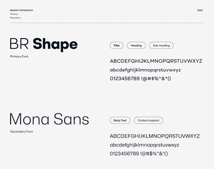
To fully leverage the power of their chosen typography, Saigon Digital ensures it's integrated into every aspect of their branding. The same font appears on their website headers, content text, and even in the body text of their communications. This consistency tells a cohesive brand story and solidifies customer recognition.Check out Saigon Digital's blog series for a wealth of useful resources and expert guidance, or contact us today to discuss your specific branding needs.Interested in more insights like this and taking your brand to the next level? Saigon Digital offers a comprehensive suite of services, including:- SEO: Increase your website's visibility in search engine results and attract more qualified leads.
- UX/UI Design: Craft a user experience that's both beautiful and functional, keeping your visitors engaged and driving conversions.


